Data science hero Roger Peng is the co-host of two different podcasts. For his first podcast, he joined Hilary Parker on a data science podcast called “Not So Standard Deviations”. Their first episode was released on September 16, 2015, and since then they have released a total of 33 episodes. That works out to a rate of 0.061 episodes per day.
But “Not So Standard Deviations” is not Dr. Peng’s only venture in the podcasting world. He has also teamed up with Elizabeth Matsui to create “The Effort Report,” a podcast covering life in academia. The first episode debuted on July 1, 2016. Matsui and Peng have produced 29 episodes, which sets a pace of 0.115 episodes per day.
Even though “NSSD” had a 9 month headstart, “The Effort Report” has been releasing episodes at a much faster rate. We can expect that the number of episodes for “The Effort Report” will someday surpass that of “NSSD.” But when can we expect this momentous historic event to occur? Just for fun, we’ll devote a couple of blog posts to using some basic data science techniques to predict an answer to this burning question.
Getting Some Data
To make a prediction, we’ll need some data to tell us when the podcast episodes have been released. Fortunately, this is easy to obtain from the podcasts’ RSS feeds. We can use R to download and process this data; we just need to make a quick function to download the feeds, parse the XML, and store it in a data.frame. Below is a function I wrote called rss.to.dataframe to do the job:
library(XML);
library(dplyr);

# a simple function for converting a list of lists to a data.frame
list.entry.to.dataframe <- function(x) {
  data.frame(as.list(x), stringsAsFactors = FALSE)
}

rss.to.dataframe <- function(url) {
  # download the RSS data as XML and use XPath to extract "item" elements
  xmlDocument <- xmlParse(url, encoding = "UTF-8");
  rootNode <- xmlRoot(xmlDocument);
  items <- xpathApply(rootNode, "//item");
  data <- lapply(items, xmlSApply, xmlValue);

  # convert the XML list to a data.frame
  df <- do.call(dplyr::bind_rows, lapply(data, list.entry.to.dataframe));

  # if the data includes a "pubDate" column, convert that to a date
  # and sort the output by that column
  if (any(names(df) == "pubDate") == TRUE) {
    df$pubDate <- as.POSIXct(df$pubDate, format = "%a, %d %b %Y %T %z");
    df <- df[order(df$pubDate), ];
  }

  # if there is a "duration" column, convert that to a difftime
  if (any(names(df) == "duration") == TRUE) {
    df$duration <- as.difftime(df$duration, format = "%T");
  }

  # add a column "n" that increments for each row
  df <- cbind(n = 1:nrow(df), df)

  podcast <- xpathApply(rootNode, "channel/title", xmlValue);
  df$podcast <- podcast[[1]];

  return(df);
}

nssd <- rss.to.dataframe("http://feeds.soundcloud.com/users/soundcloud:users:174789515/sounds.rss");
effrep <- rss.to.dataframe("http://effortreport.libsyn.com/rss");
We need to do just a little bit of cleaning on the data. The first item in NSSD’s RSS feed was a sort of teaser for the podcast and is not considered to be an official episode. So I’ll remove it from the data.frame and re-number the remaining rows so our episode counts will be correct.
# Data Cleaning
# remove the first row from NSSD because it's not really counted as an episode
nssd <- nssd[nssd$title != "Naming The Podcast", ];
nssd$n <- nssd$n - 1;

# For reproducibility in the future, make sure we remove any entries after the date this post was published
as.of.date <- as.POSIXct("2017-03-07 12:00:00");
nssd <- nssd[nssd$pubDate < as.of.date, ];
effrep <- effrep[effrep$pubDate < as.of.date, ];
Great! Now we have two data.frame objects, one for each podcast. To make our analysis easier, we can combine the two into one. We can also take this as an opportunity to cut out some extraneous columns.
# select the columns we need and then union together the two data frames
columns <- c("podcast", "n", "pubDate", "duration");
episodes <- rbind(nssd[, columns], effrep[ , columns]);

# add a column so we can identify the rows that were actually observed
# (as opposed to the forecast values we will soon be adding)
episodes$type <- "actual";
Making a (Very Basic) Forecast
When conducting a data analysis, I like to take a “start simple” approach. This allows me to quickly study the data and produce some rough results before investing time in a more complex approach. Here I’ll implement that strategy by making a very basic assumption that both podcasts will continue releasing episodes at the same rate. Using this very simple model, we can predict the days on which upcoming episodes will be released.
First, let’s compute the rate at which the podcasts have been released.
# Determine the rate at which podcast episodes are being released
# first, make a simple data frame with the first and last episode of each podcast
first.last <- episodes %>%
                group_by(podcast) %>%
                summarize(first = min(pubDate), last = max(pubDate), count = max(n)) %>%
                arrange(first);
first.last <- data.frame(first.last);

# Compute how many days each podcast has been around and then compute a "days per episode" rate
first.last$days <- with(first.last, as.numeric(last - first));
first.last$rate <- with(first.last, days / (count - 1));
Now let’s extend that trend! I’ll pick an arbitrary future episode of the podcasts… let’s say Episode #45.
Assuming that Dr. Peng produced podcast episodes at a steady rate, on what date should each of the 45 episodes theoretically have been released?
# using each podcast's episode release rate, construct a data set with
# the expected release date of the first 45 episodes
projected <- merge(first.last, 1:45, all = TRUE);
projected$pubDate <- with(projected, first + ((y - 1) * rate * 24 * 60 * 60));
projected$n <- projected$y;
projected$type <- "trend";
projected$duration <- NA;
We now have a data frame called projected that has the thoretical release dates for 45 episodes of each podcast assuming that production had proceeded at a constant rate.
Answering the Big Question
Now that we have a simple forecast of release dates for future episodes, we can look at those projected release dates to see when “The Effort Report” will surpass “Not So Standard Deviations”. Here’s what we find:
| Episode Number | Not So Standard Deviations | The Effort Report |
|---|---|---|
| 38 | 2017-05-16 | 2017-05-19 |
| 39 | 2017-06-02 | 2017-05-28 |
| 40 | 2017-06-18 | 2017-06-06 |
According to our simple linear forecast, episode #39 of “The Effort Report” will be released on May 28, 2017. That is 5 days before “Not So Standard Deviations” will release its 39th episode. Thus we will consider this to be the “cross-over” point.
Output from “The Effort Report” will surpass “Not So Standard Deviations” on May 28, 2017.
Visualizing the Forecast
As usual, the easiest way to quickly understand the podcast output and our predicted release rate is to plot it out. This sounds like a job for ggplot2!
Remember that we have two data frames, one with the actual episodes and one with our expected release dates based on our linear forecast. To make our plot easier, we’ll combine those two data frames into one. We can also convert our strings to factors.
# combine our projected episode data with the actual episode data
episodes <- rbind(episodes, projected[ , names(episodes)])

# change data types to be better suited for plotting
episodes$podcast <- factor(episodes$podcast)
episodes$type <- factor(episodes$type)
episodes$pubDate <- as.Date(episodes$pubDate)

# We want to annotate our plot so make a nice label for that
label.text <- paste("Episode", cross.points[cross.index, "Episode Number"], " - ", format(cross.points[cross.index, 3], "%B %e, %Y"));

library(ggplot2);
ggplot() +
  geom_line(data = episodes, aes(x = as.Date(pubDate), y = n, color = podcast, linetype = type, size = type)) +
  scale_size_manual(values = c(1.2, 0.5)) +
  scale_x_date(date_labels = "%b %Y") +
  labs(x = "", y = "Number of Episodes Released", title = "Podcast Output Forecast (using simple linear method)") +
  geom_point(data = data.frame(x = cross.points[cross.index, 3], y = cross.points[cross.index, "Episode Number"]), aes(x = x, y = y), size=2, color="#00BFC4") +
  annotate("text", x = as.Date("2017-02-25"), y = 43, hjust = 1, label = label.text, color="#00BFC4") +
  annotate("segment", x = as.Date("2017-03-01"), xend = cross.points[cross.index, 3] - 9, y = 42.75, yend = cross.points[cross.index, "Episode Number"] + 0.25, color = "#00BFC4")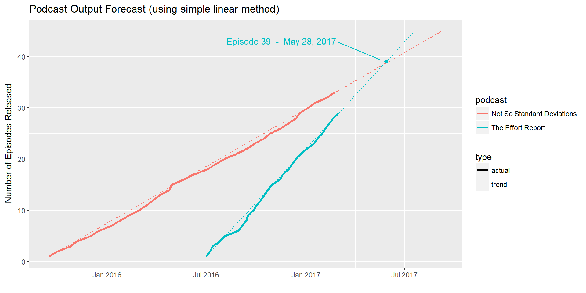
This plot allows us to easily see that the episodes have been released at a consistent rate, and it shows us when we can expect the two trendlines to converge.
Conclusion
The plot reveals that overall Dr. Peng has been fairly consistent with his release schedule. This gives us hope that our simple linear forecast could actually be accurate. Check back next week; I’ll be using the forecast package on this same data set to try to make a more advanced forecast.
And keep your eye on those podcast RSS feeds. We’ll soon find out how accurate my forecasts really are!